


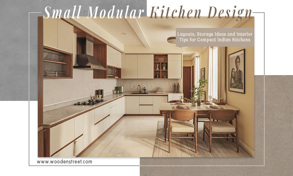
Discover practical layouts, clever storage solutions, and stylish kitchen interior for small kitchen spaces. This blog shares space-saving tips, modular setups, and tiny kitchenette ideas tailored for compact Indian apartments and homes, helping you create a functional yet modern cooking space without compromising comfort or aesthetics.
A small kitchen is not the problem. A poorly planned small kitchen is.
That's a distinction worth holding onto before you start making any decisions. Because the same 55 square feet of kitchen space can feel impossibly cramped or surprisingly functional. This, as a result, depends entirely on the choices made inside it, such as layout, cabinet height, corner solutions, and lighting. These things change how a kitchen feels as well as works far more than the size of the room ever could.
This blog column is specifically about small modular kitchen design, which means factory-made, configurable cabinet units that are planned and installed as a system. Not carpenter-built kitchens, not open shelf arrangements, it’s all about going for modular. If you’re trying to figure out the right layout for your compact kitchen, what cabinet decisions actually matter, how to get serious storage out of a tight space, plus what finishes make a small kitchen interior feel larger than it is, then this the guide for you.
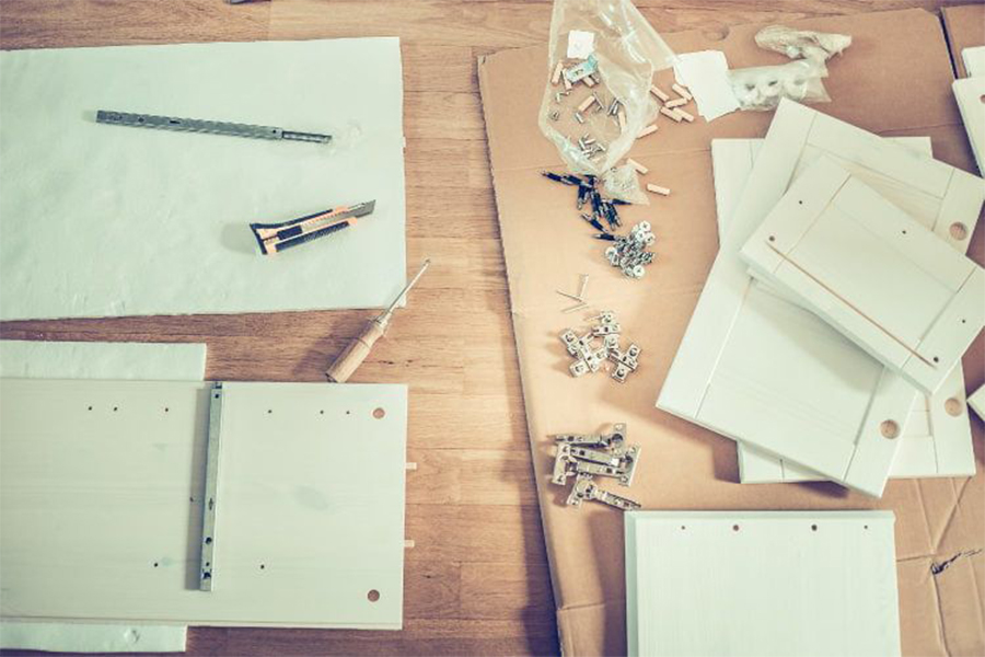
A lot of first-time buyers don't know there's a meaningful difference between a modular kitchen and a carpenter-built one. There is. And in a small kitchen, the difference matters more than it does in a large one.
Modular kitchens are made in a factory to precise dimensions. The units arrive on site already built, already finished, and they slot together with a level of accuracy that on-site carpentry simply can't match. In a compact kitchen where every centimetre counts, that precision is not a luxury. A carpenter measuring and cutting on site, even a skilled one, introduces variability. Tight corners get a little loose. Narrow walls get a unit that's slightly off. These small errors compound in a small space.
The practical comparison looks something like this:
|
Modular Kitchen |
Carpenter-Built |
|
|
Precision |
Factory-made, exact dimensions |
On-site, prone to measurement errors |
|
Small space suitability |
Better, units can be configured to the centimetre |
Harder to optimise tight corners and narrow walls |
|
Timeline |
2 to 4 weeks |
4 to 8 weeks |
|
Replaceability |
Individual units can be replaced |
Full redo if one section fails |
|
Cost |
Mid to high |
Low to mid |
The replaceability point is one that people don't think about until they need it. Five years from now, if one base cabinet gets water damage, a modular kitchen lets you replace that unit. A carpenter-built kitchen often means a full redo of the affected section.
Layout is the first decision and the most consequential one. Get it wrong and no amount of clever storage or nice finishes will fix the cooking experience.
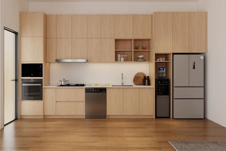
Everything on one wall. Counter, hob, sink, and storage all running in a single line. This is the tiny kitchen design that appears most often in studio apartments and compact 1BHKs where the kitchen is more of an alcove than a room.
It works best in kitchens under 60 square feet or in narrow spaces where two facing walls simply aren't an option. The honest limitation is that there's no real work triangle. All three cooking zones are in a line, which means more back-and-forth movement than any other layout.
The way to make it work: go floor to ceiling on wall cabinets without exception. A single wall kitchen has a limited counter run, which means counter storage is restricted. The vertical space above is what saves it.
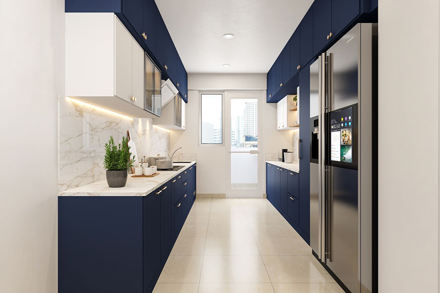
Two parallel counters facing each other with a corridor running between them. For a narrow rectangular kitchen, this is genuinely the most storage-efficient layout available. You're essentially getting double the counter and cabinet run of a straight kitchen in the same floor footprint.
Best suited to kitchens where the width falls between six and eight feet. The corridor between the two sides needs to be at least 36 inches wide. Below that and two people can't work side by side, which in an Indian household is a real daily inconvenience.
The way it works best: one side handles cooking, the hob and prep counter, and the other handles cleaning, the sink, and general storage. This keeps the work triangle natural and short.
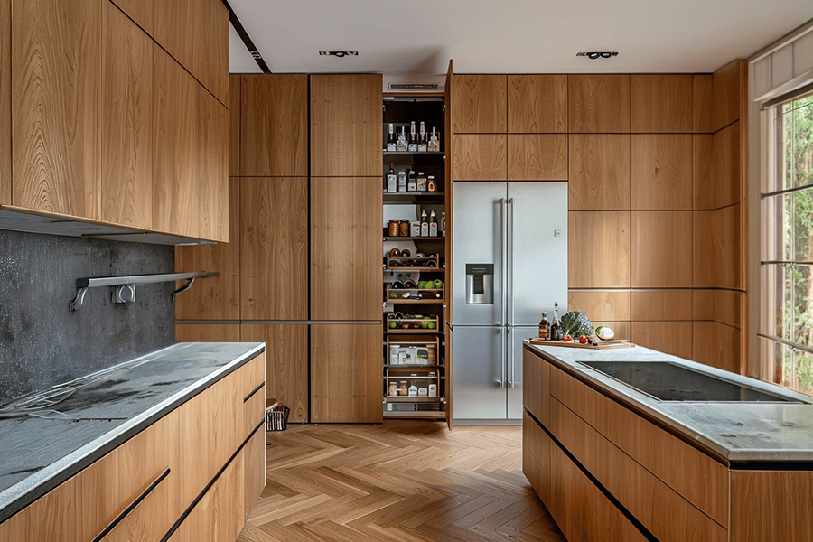
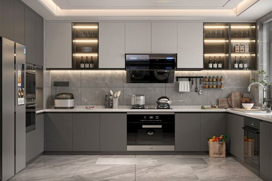
Two adjacent walls, counters and cabinets running along both. This is the most versatile small home kitchen design for Indian compact homes and it suits square or slightly rectangular kitchens between 60 and 100 square feet.
The corner junction where the two walls meet is the most important design decision in an L-shaped kitchen. A standard closed corner wastes a significant volume of cabinet depth that you simply can't reach. A magic corner pull-out or a carousel unit recovers most of that depth and makes it accessible. More on these in the cabinet section.
The other natural advantage of the L-shaped layout: the open end of the L faces outward, which in most Indian home plans means it opens toward the dining area. The kitchen and dining space connect visually without needing a formal divider.
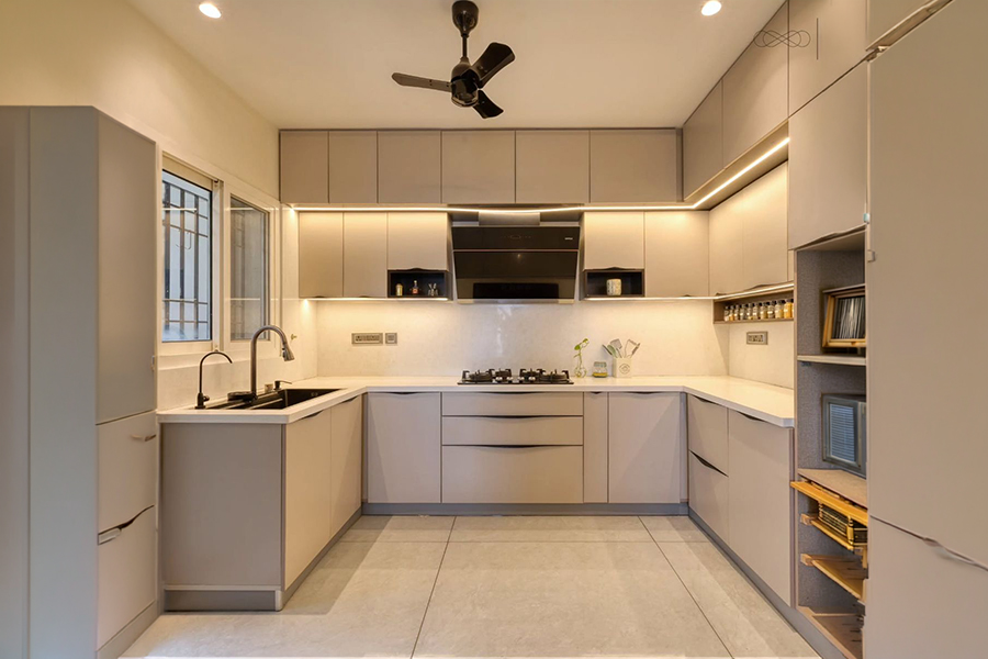
Three walls of counter and cabinet. Maximum storage, maximum counter run. The most capable layout of the four.
The constraint is clear: the kitchen needs to be at least eight feet wide for the corridor inside the U to remain comfortable. Below that and the space between the three walls starts to feel like a corridor rather than a kitchen. In kitchens under 80 square feet, the enclosed quality of a U-shape tends to outweigh the storage benefits.
Where it genuinely excels is in compact kitchens that happen to be square rather than rectangular, where all three walls are accessible without the layout feeling trapped.
Sink, hob, refrigerator. These three points form what kitchen designers call the work triangle, and the distances between them determine how tiring or effortless your kitchen is to actually cook in.
The ideal total perimeter of the triangle is somewhere between 12 and 26 feet. Below 12 and the kitchen feels cramped, everything too close together. Above 26 and you're doing unnecessary walking every time you cook.
In small kitchens, the triangle naturally tightens toward the lower end, which is usually fine. The real problem in compact kitchen interior for small kitchen plans is the refrigerator. In a rush to fit everything in, the fridge often ends up outside the work triangle entirely, pushed into a corner or against a distant wall. Then every time you need something from it while cooking, you're crossing the kitchen.
One detail that seems small but isn't: the direction the refrigerator door swings. It should always open toward the prep counter, not away from it. When a fridge door swings away from where you're working, every trip to get something means a 180-degree turn with your hands full. This is the kind of thing nobody notices in a showroom, and everyone notices within a week of actually living with the kitchen.
The single highest-impact cabinet decision in a small modular kitchen design is height.
Standard wall cabinets stop at around seven feet. The space between the top of the kitchen cabinet and the ceiling sits empty, collecting grease and dust and making the kitchen feel like it has a dropped ceiling. In a small kitchen this gap does genuine damage. It makes the room feel shorter and heavier.
Floor-to-ceiling cabinets run the full height of the wall. The upper section stores things you don't reach for daily, seasonal cookware, appliances used occasionally, extra provisions. The visual effect is significant. A continuous vertical surface makes the kitchen feel taller and more considered. It reads as designed rather than assembled.
A very common mistake in kitchenette designs for small spaces is filling the lower run with base cabinets and leaving the wall relatively bare. It looks fine in a plan but in practice a kitchen heavy on lower cabinets and light on wall cabinets feels dark and cluttered. The lower half of the room is dense. The upper half is empty. The counter ends up being the default storage surface because there's nowhere else for things to go.
The better balance for small kitchens: more wall cabinet area than lower cabinet area. Counter stays clear. Storage moves up. The kitchen feels lighter.
One useful move: leave one section of wall cabinets open as shelving rather than closed fronts. It breaks the visual monotony of closed cabinet doors running the full wall, it displays everyday items so they're easy to grab, and it reduces the weight the kitchen visually carries. The condition: that shelf has to stay organised. An open shelf full of random things makes a small kitchen look smaller, not larger.
In a narrow galley kitchen, door handles on both sides of the corridor reduce your effective walking width by two to three inches. That doesn't sound like much until you're actually moving in the space. Handleless cabinet fronts, either push-to-open mechanisms or recessed grip edges, eliminate this entirely.
The other benefit is visual. A handleless cabinet surface is seamless. No hardware breaking the line of the front. In a small kitchen this creates a cleaner, more continuous surface that makes the space feel larger than a handled version of the same design.
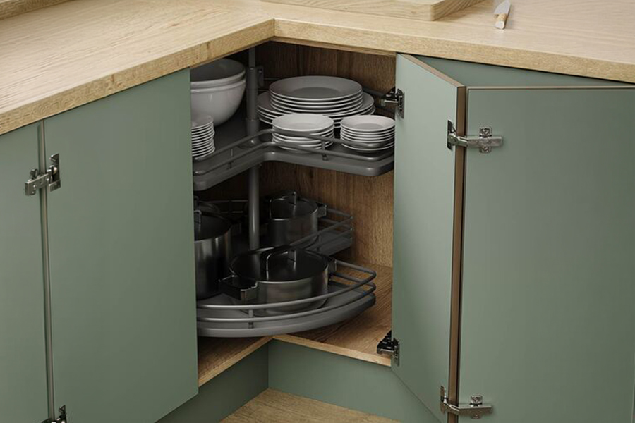
Corners are where small kitchen storage plans fall apart most often. A standard closed corner cabinet looks like storage on paper. In practice, the back half is unreachable without pulling everything out from the front.
Three solutions, in order of how well they actually work:
A magic corner pull-out has two shelves that swing out of the corner on a hinged mechanism. When you open the door and pull, the shelves come to you. Nearly all the depth of the corner becomes accessible. This is the best corner solution available.
A carousel or lazy Susan is a set of rotating circular shelves inside the corner unit. Slightly less accessible than a pull-out, but lower cost and still significantly better than a standard closed corner. Works well for everyday items.
A diagonal corner cabinet cuts the corner at 45 degrees, replacing the right-angle with a straight cabinet face. Easier to reach into than a standard corner but it gives up some storage volume in the cut. Better than nothing, not as good as the first two options.
The cabinet shell is the structure. What's inside it determines how much the kitchen actually holds and how easily you can use it.
Pull-out drawers in base cabinets versus fixed shelves. This is not a small difference. A base cabinet with fixed shelves requires everything stored in the front to be moved before you can reach anything at the back. A pull-out drawer brings the full depth of the cabinet to you in one motion. For pots, pans, and provisions that live in base cabinets, drawers recover a meaningful amount of storage that shelves leave practically unusable.
A tall pantry pull-out is one of the most space-efficient units available for a tiny kitchenette ideas brief. A floor-to-ceiling pull-out column, as narrow as 12 inches wide, holds the equivalent of three or four standard cabinets worth of provisions on multiple shelves. It pulls out completely so everything is visible at once. In a kitchen where linear space is tight, a pantry pull-out gets enormous storage out of a very small footprint.
The under-sink space is almost universally wasted in standard kitchen plans. The pipe and U-bend take up some of it but not all of it. A pull-out bin unit uses the space beside the pipe for waste and recycling. An adjustable shelf system with a cutout around the plumbing recovers the remaining depth for cleaning supplies and spare bottles.
Wall-mounted knife strips, spice rails, and utensil hooks keep items that normally live on the counter off the counter entirely. The counter is a workspace, not a storage surface. Every item permanently parked on it reduces the area available for actual cooking.
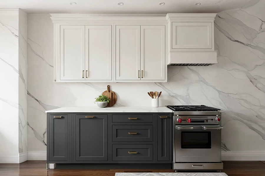
Light laminates in white, cream, light grey, or pale wood tones reflect light back into the kitchen. The room feels brighter and larger than it physically is. Dark kitchen aesthetics look genuinely impressive in large kitchens. In a small kitchen, they require at least 100 square feet to avoid feeling like you're cooking inside a box.
Matte finishes hide fingerprints and surface scratches better than glossy ones. In a daily-use Indian kitchen where the surfaces are handled constantly and cooking produces steam and grease, matte is the more practical finish. Glossy reflects more light, which is a real advantage in a small space, but it shows every mark and needs wiping down constantly to look the way it did in the showroom.
A continuous backsplash tile running from the counter surface all the way up to the bottom of the wall cabinet without a break makes the wall run feel longer and more unified. A gap between the counter and the tile, or a tile that stops short of the cabinet, creates a visual interruption that chops the wall into sections and makes the kitchen feel smaller.
Integrated appliances, a built-in microwave flush with the cabinet line, a hob that sits level with the counter, make the kitchen surface read as one continuous plane. Appliances sitting on open shelves or on the counter break that line. In a small kitchen, visual continuity is a real spatial tool.
A single overhead light in the centre of the kitchen creates shadows directly on the counter. You're standing between the light source and the work surface, which means you're cooking in your own shadow. It's the worst possible outcome for a workspace.
Small kitchens need three layers of light.
Under-cabinet task lighting, LED strips mounted on the underside of wall cabinets, shines light directly onto the counter surface with no shadow. This is the most functional lighting change available in a kitchen and in many cases it costs less than you'd expect. The counter is where the actual work happens. It needs direct light.
Inside cabinet lighting, for glass-front cabinets or open shelving, makes the kitchen feel layered and considered. It's not functional in the direct sense but it adds depth to the room and makes the space feel more intentional.
Overhead ambient light, a flush ceiling fixture or recessed downlights, is the base layer. The whole kitchen needs general brightness. But it should not be the only light source because it cannot do the job on its own.
Colour temperature matters here too. Warm white in the 2700K to 3000K range makes food look better and the space feel less clinical. Cool white above 4000K is fine for an office or a workshop. In a kitchen it makes everything feel slightly harsh.
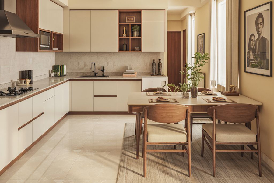
In most compact Indian homes, the kitchen and the dining area are either adjacent or combined into one continuous space. How these two areas relate to each other affects how both of them feel.
A kitchen trolley placed between the kitchen and the dining area does three things at once. It adds prep counter space when cooking. It provides additional storage in drawers or shelves below. And it acts as a visual buffer between the cooking zone and the eating zone without being a wall. The transition feels intentional rather than arbitrary.
An extendable dining table placed just outside the kitchen entrance solves a very specific Indian hosting problem. A table that seats four comfortably for daily use and opens to seat six when needed gives you both things without permanently occupying the floor space a six-seater would require every day.
Matching the kitchen cabinet finish with the wood tone of the dining furniture creates a visual continuity between the two spaces. When the kitchen and dining area read as one considered zone rather than two separate rooms pushed together, both spaces feel larger.
We will be back with the next blog soon. Till then, stay tuned!
Image Source: Pinterest, Google, and Wooden Street
A L-shaped and parallel kitchen layouts work best for small Indian homes. They maximise counter space, improve movement, and provide efficient storage without making the kitchen feel cramped.
A A modular kitchen can fit into spaces as small as 6x8 feet. Smart layouts, compact appliances, and vertical storage help create a functional kitchen in limited areas.
A Yes, handleless cabinets are practical and stylish for modern kitchens. They save space, create a seamless look, and are easy to maintain with push-to-open or groove handles.
A Use tall cabinets, corner units, wall-mounted shelves, pull-out drawers, and organisers to maximise storage. Vertical storage solutions help utilise every inch of a compact kitchen efficiently.
A Light colours like white, beige, pastel grey, and soft cream work best for small kitchens. They reflect more light, making the kitchen appear brighter, larger, and more spacious.
A A magic corner unit is a smart storage solution designed for corner cabinets. It uses pull-out trays or baskets to access hard-to-reach spaces easily and efficiently.
Trending Products
Top Picks from EveryoneArticles you will love to read
Kitchen is the more than merely a serviceable space in the home and thus, we want to look its best and clutter-free. Therefore, WoodenStreet is here with the modular kitchen design ideas blog to pull out your kitchen layout in the perfect way.
Continue Reading
A kitchen is a place where everyday magic happens. Groceries go in and come out in the form of delicious and finger-licking food. But, to maintain all functioning kitchen cabinets plays a vital role.
Continue Reading
Make your kitchen space more efficient and decorated with these 25 best kitchen furniture ideas. Bring out the true beauty of your kitchen without worrying about the size of your space.
Continue Reading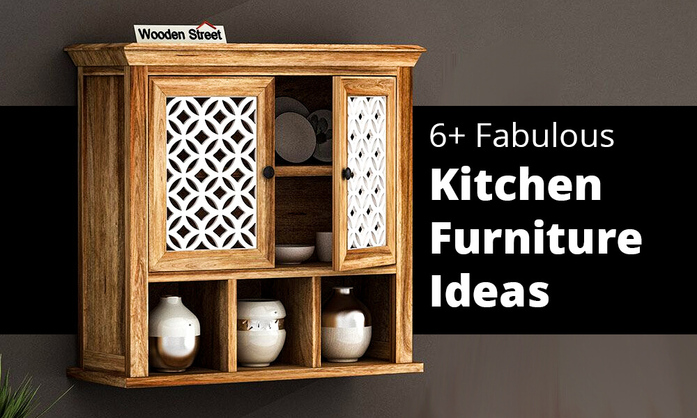
Increase the efficiency & beauty of your kitchen space with these amazingly designed storage furniture options.
Continue Reading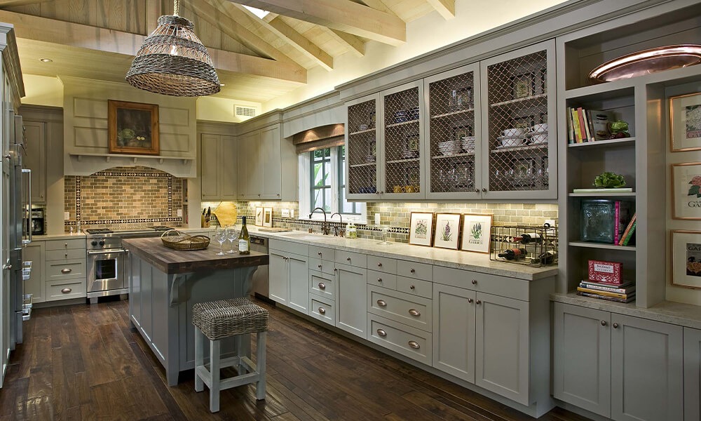
The kitchen is the heart of our house, and what is better than restyling it to welcome the new year with zestful hopes? With these below-mentioned trendiest kitchen designs for 2022, Start Off the Year with the Right Vibe!
Continue Reading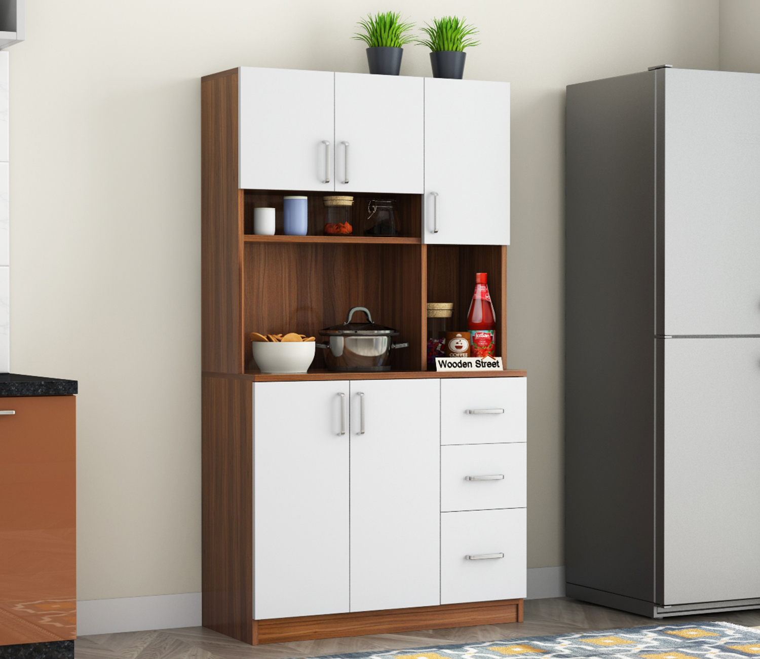
/2.jpg)
