


Discover 12+ inspiring temple mandir colour combination ideas to infuse your pooja ghar with serenity and divine charm. This guide covers soothing shades, Vastu-friendly hues, and design tips to create a spiritually uplifting worship space at home

Are you planning to refresh the look of your pooja ghar or set up a new mandir at home? You are definitely not alone. Many people these days want a peaceful corner that feels calming, welcoming, and filled with positive energy. One thing that truly changes how your pooja room feels is the mandir colour you choose for it. The right temple colour can make the space glow, feel pure, and be instantly soothing. In this blog, we are going to talk about why mandir colour matters, how different shades affect the mood of your pooja ghar, vastu suggestions for colour for pooja room, and some beautiful pooja mandir for home colour combinations that you can easily use at home. Let’s take a look at how a simple colour choice can transform your spiritual space.
The mandir colour in your pooja ghar quietly sets the mood long before you begin praying. A gentle shade can calm your thoughts, slow you down, and make the space feel warm and welcoming. Many families don’t realise how strongly pooja room colours influence their everyday peace until they switch to softer tones and feel the difference. The link between home temple colour and positivity in vastu is also something you naturally sense—when the colours suit the space, everything feels lighter. The most common mistake people make is choosing flashy or very dark shades that overpower the mandir walls instead of supporting a peaceful atmosphere.
When selecting the best colour for pooja room as per vastu, the idea is very simple: you can go for shades that make the room feel open, calm, and pure. According to Vastu, you must go for soft colours because these reflect the light beautifully and can help in keeping your mind steady. White, yellow, light pink, and cream are favorites for a reason, as these colors feel quite soothing the moment you walk in. These tones also work well in small flats where you want the mandir walls to look bright without being loud. Dark or heavy shades are usually avoided because they create a closed, dull feeling. The best colour for pooja room is the one that supports clarity and helps the space feel effortlessly spiritual.
Here are some colour combinations that work wonderfully for temple spaces. Each one brings a different mood, so you can choose what feels right for your home and your style. These ideas also pair well with marble temple for home designs or compact pooja ghar corners.
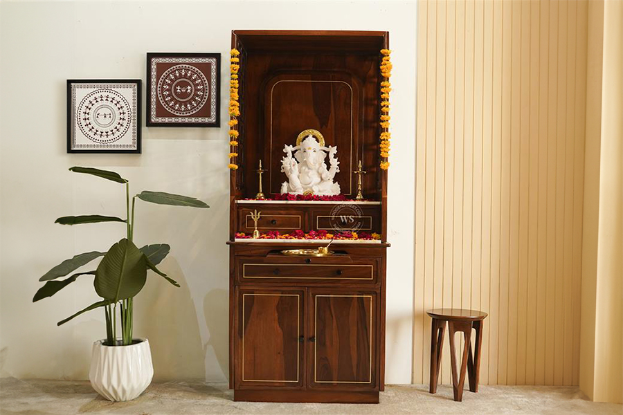
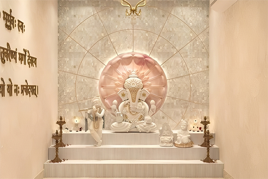
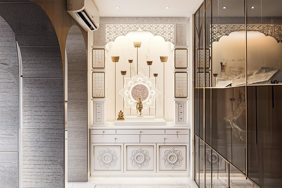
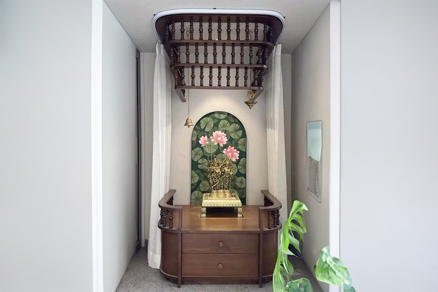
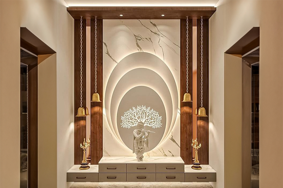
This pairing is clean and majestic at the same time. The white keeps the room bright, and the gold adds a divine glow when the diya is lit, making it a great mandir colour option. It works especially well for small pooja rooms because the white opens up the space while the gold highlights carvings and idols beautifully without making the mandir look heavy or overwhelming.
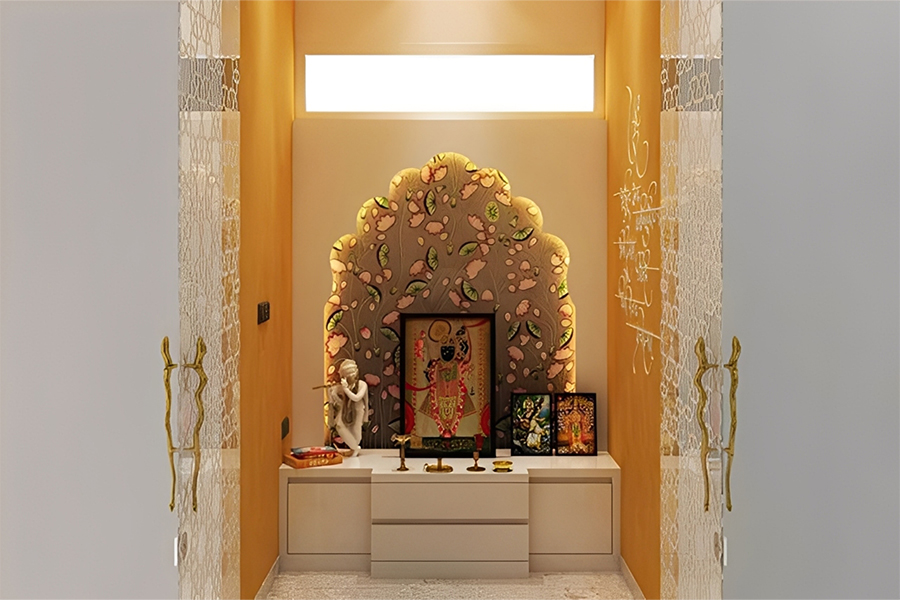
Saffron has a warm spiritual energy. Beige softens it and makes the whole space feel grounded and traditional. This combination works wonderfully for wooden mandirs and pooja ghar designs because saffron adds a devotional charm while beige keeps the surroundings calm, ensuring the area maintains a soothing and sacred atmosphere throughout your daily rituals.
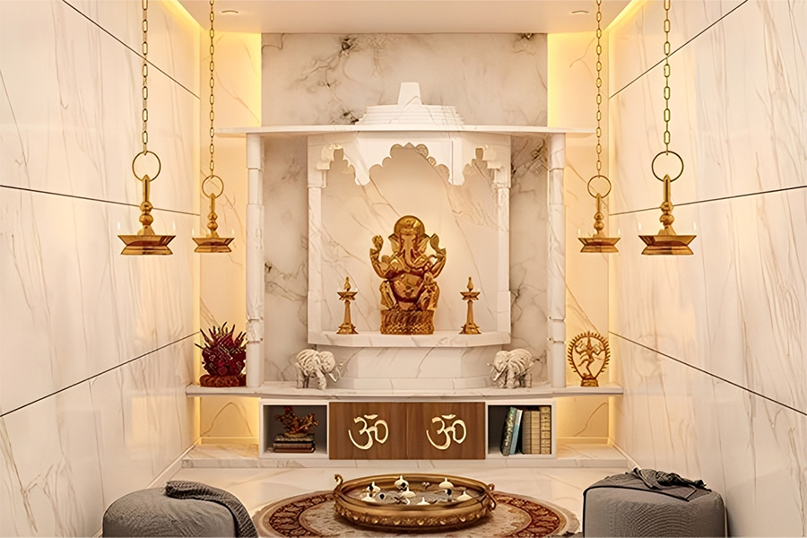
Marble already has a natural shine. A little gold carving or border enhances the temple’s presence without overpowering the room. This combination looks especially beautiful for a marble temple for home because the white base reflects light well while the gold adds a luxurious yet gentle touch, making the space feel serene and timeless.
A soft yellow reminds you of early sunlight. Sandstone has a natural texture that adds depth. Together they make the room feel warm and sacred — great for pooja room colour choices. This combination works well for both open pooja shelves and enclosed mandirs because it blends brightness with earthy calmness, creating a naturally uplifting environment.
Cream is gentle and easy on the eyes. Copper brings a soft earthy sheen that looks beautiful near temple bells and diyas. This pairing creates a warm, welcoming corner in your home, making it perfect for traditional pooja rooms where natural elements and mild colours help maintain a peaceful and balanced spiritual atmosphere every day.
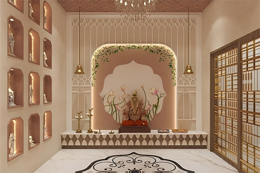
This combination creates a very soft and comforting mandir. Pastel pink brings tenderness and ivory keeps it calm. These colours work beautifully for compact pooja ghar spaces because they add warmth without making the area look cluttered, allowing you to build a soothing spiritual corner where the ambience feels fresh, light, and deeply comforting.
Lilac has a healing quality. White balances it and keeps the room fresh. Perfect for meditation corners, this combination helps the mind slow down and settle. It works well for modern mandir setups because lilac adds a gentle emotional depth while white reflects light, keeping the pooja space clean, airy and serene throughout the day.
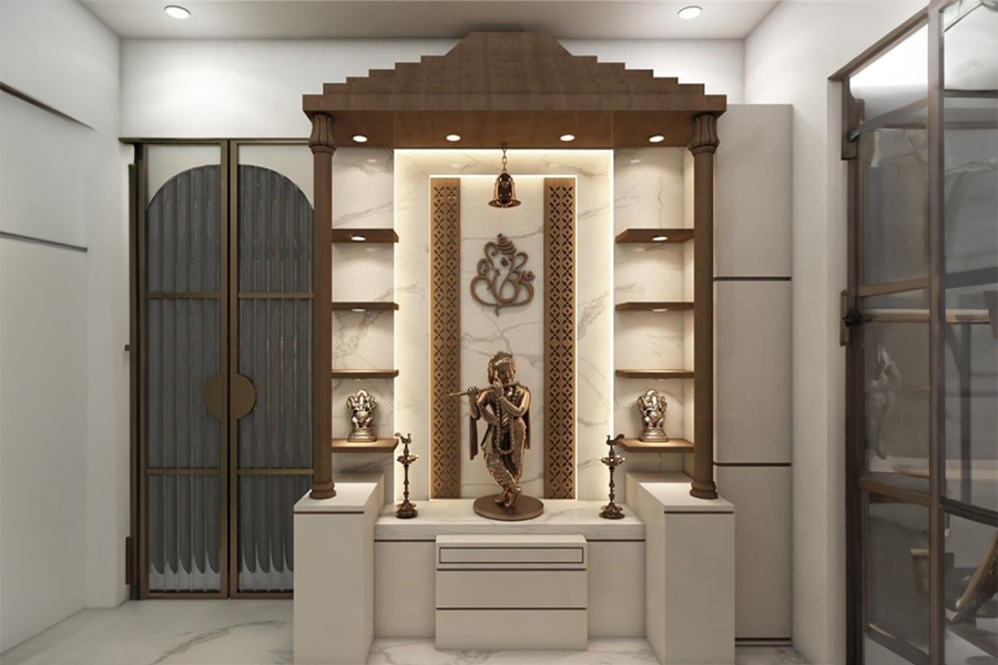
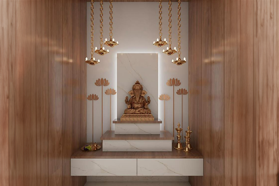
If you like earthy designs, this pairing feels stable and warm. Brown adds depth, while off-white keeps the room open. This combination works well for wooden mandirs and pooja rooms with natural textures because it creates a grounded yet bright space, making your spiritual corner feel both peaceful and connected to nature at the same time.
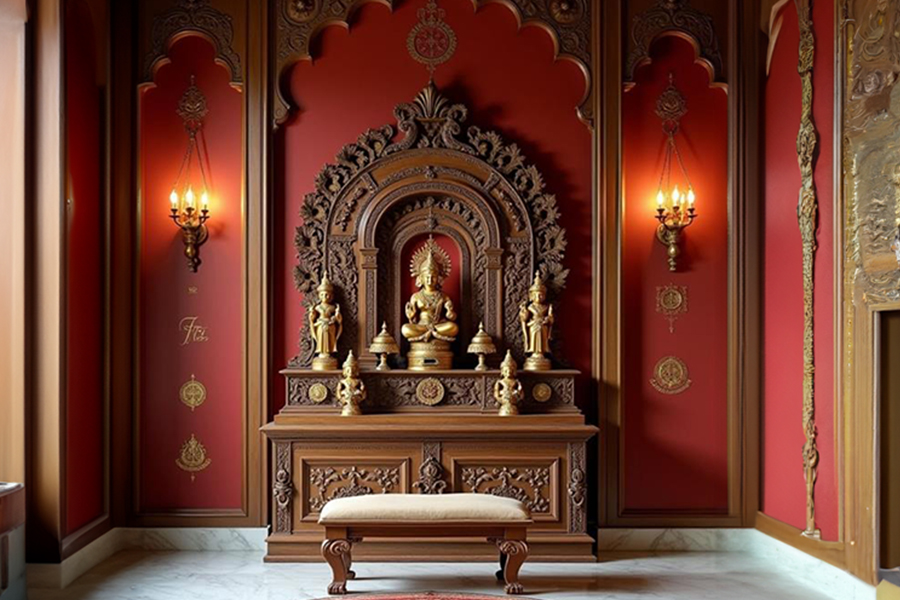
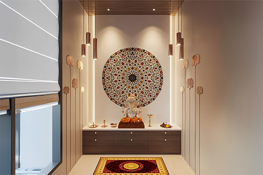
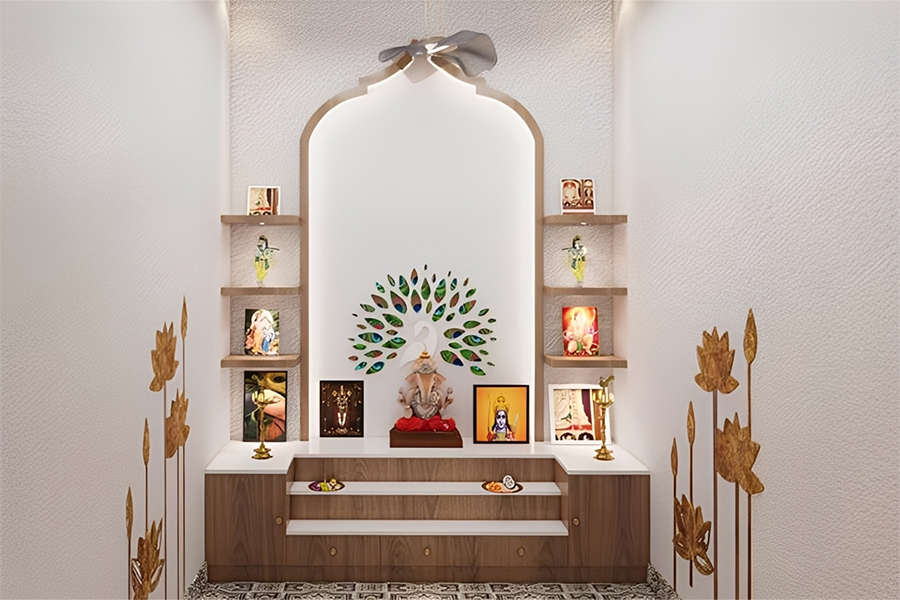
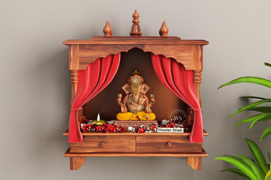
This works well if you love a traditional Indian temple look. A muted red combined with gold feels rich and festive. The combination highlights idols beautifully and brings a sense of celebration into daily rituals, making it ideal for households that prefer a more cultural and classic mandir appearance with bold yet harmonious temple tones.
Blue has a calming vibe. Silver adds a clean shimmer and looks lovely in modern mandir setups. This pairing is perfect for contemporary pooja spaces because the blue soothes the mind, while the silver brings a soft glow when diyas or spotlights are lit, creating a peaceful and visually balanced temple experience.
Green brings freshness. White keeps the space clear. This combination feels pure and full of life. It works beautifully for homes that prefer nature-inspired decor because the green adds a soft natural touch, while the white keeps the mandir looking clean and bright, creating a calm and refreshing environment for prayer and reflection.
This is for people who like rustic designs. Sandstone and terracotta together give a natural and grounded feel. The earthy tones add warmth and depth, making your pooja space feel rooted and serene. It works especially well in homes with traditional décor, where natural textures enhance the spiritual ambience effortlessly and beautifully.
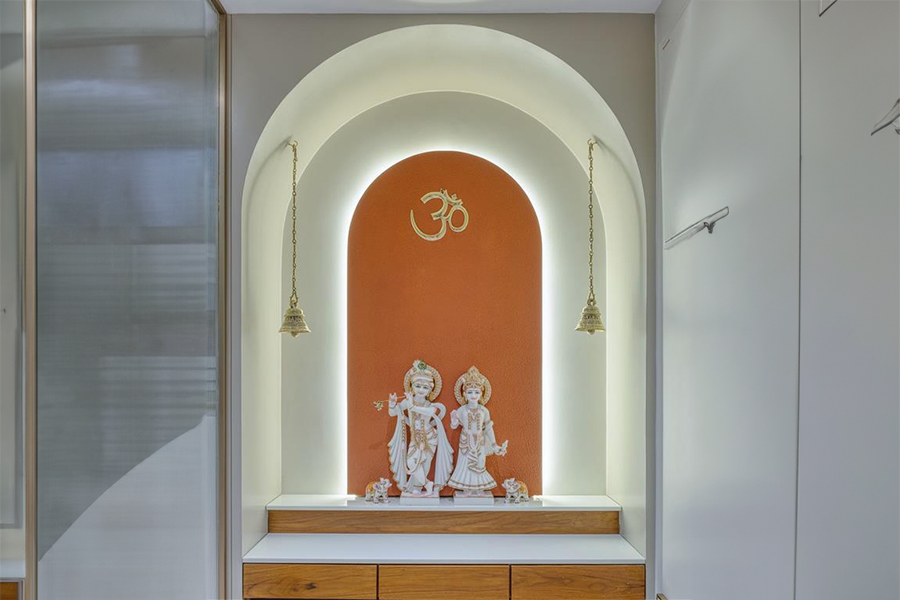
Orange feels bright and auspicious. White makes it look balanced. This combination lights up even a small mandir and pairs beautifully with temple mandir colour combination styles. The orange adds joyful energy, while the white prevents the space from feeling intense, creating a lively yet peaceful corner perfect for everyday prayer and meditation.
If you are designing a pooja corner in an apartment, lighter tones work the best. Shades like cream, powder blue, pastel yellow, and light peach make a small corner feel more open. Floating wooden mandirs look especially good in small homes because they do not take up floor space. When the wood sits against a soft wall colour, the entire setup looks clean and modern. This works beautifully even for compact pooja ghar layouts.
Lighting plays a big part too. Warm white lights gently highlight the idols and reflect nicely on lighter paint shades. A simple spotlight or a small strip light behind the mandir panel can create a beautiful effect in a compact room.
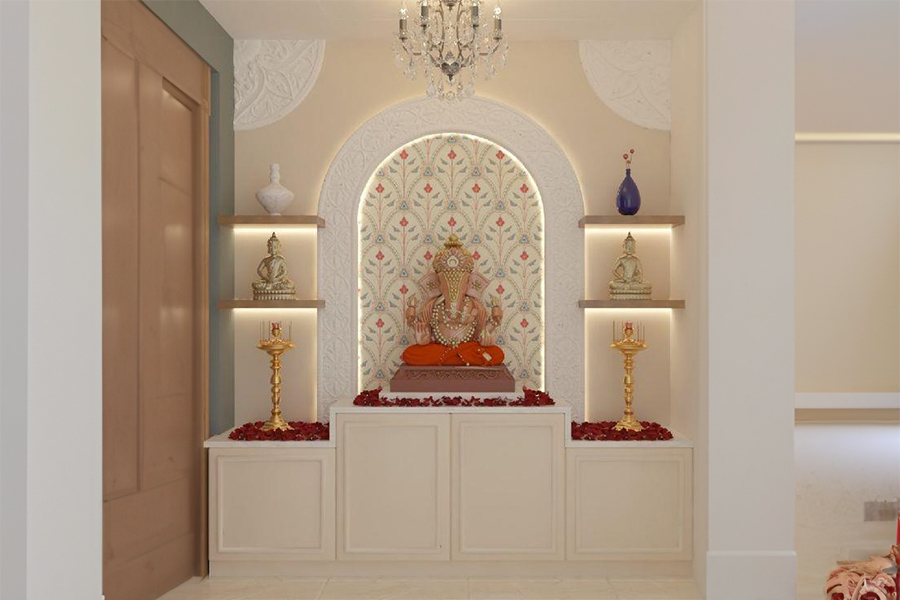
A marble mandir already has a peaceful presence because of its natural white tone. It blends beautifully with soft colours like beige, pale yellow, rose pink, and even a subtle grey. These colours bring out the carvings and fine details of the temple without stealing attention. This is why marble temple for home remain a popular choice for pooja ghar designs.
If your pooja room receives natural light, shades like cream or soft yellow create a lovely warm glow. If the room stays slightly dim, clean white or pastel colours help brighten the space.
For wooden and marble combinations, colours such as ivory, almond white, soft green or warm beige work very well. They complement both materials and keep the atmosphere calm.
Trending colours for 2025 are moving towards earthy tones, soft pastels, natural clay shades, and gentle metallic highlights. The idea is to create a peaceful environment with colours that feel close to nature. Whether you choose mandir colour paint, temple colour shades or puja room colour options, staying close to nature always works well.
A pooja room does not have to be large or very decorated. What matters most is how the overall space is making you feel when you sit quietly or are looking for peace for a few minutes. When the colours are chosen properly, the mandir becomes a place where you can breathe, reflect, and feel connected. This is just so right for every pooja ghar, whether it is a marble temple for home or a simple wooden mandir. If you use Vastu-friendly colours such as white, cream, light yellow, and pastel pink, they are going to help you in keeping the room calm. You can also choose combinations that are going to match your choices. If you want to explore beautiful mandir designs, wooden temples, and pooja room colour ideas, you can check the latest collections at Wooden Street. You will find plenty of options that fit both traditional and modern homes, including mandir colour paint references, temple mandir colour combination concepts, and pooja ghar inspirations.
Let your pooja ghar fill your home with peace, warmth, and divine energy.
We will be back with the next blog soon. Till then, stay tuned!
Image Source: Pinterest, Google, and Wooden Street.
Related Blogs
Unique & Modern Home Temple Design Ideas for a Peaceful and Stylish Space
Pooja Room Door Designs That Blend Tradition, Modern Style & Positive Energy
Top 15 Middle Class Indian Style Pooja Room Designs
A Soft, calming shades like white, cream, light yellow, and pastel greens are ideal for a pooja room. These colours create a serene atmosphere, enhance focus during prayers, and reflect purity and peace.
A Warm tones like yellow, saffron, and pastel orange, along with soothing whites and light greens, bring positivity to a home mandir. These colours radiate divine energy and help create a peaceful, uplifting environment
A As per Vastu, choose light and calming colours like white, cream, light yellow, or pale green for your mandir. These shades promote purity, peace, and spiritual harmony while enhancing positive vibrations in the space.
A The northeast direction is ideal for a pooja room as per Vastu. Choose colours like white, cream, light yellow, or soft green to maintain high energy, purity, and harmony in this sacred space.
A A marble temple pairs beautifully with soft colours like white, beige, pastel yellow, or light pink. These gentle tones highlight the natural elegance of marble and create a soothing, divine atmosphere.
Trending Products
Top Picks from EveryoneArticles you will love to read

Decorating your home is all about making your home look more beautiful. Interior Designing experts from Wooden Street brings you some interior decorating tips you should consider to transform your home into you dream abode.
Continue Reading
Sis: Rakhi is coming, you must come home on time. Bro: Oh no, not again! I will have to give you a gift again. Sis: No need for this; your love is enough for me. Bro: Is that so? Let's do something new this time. Why don't you bring a gift for me? Ev
Continue Reading
Celebrate this Teacher's Day by appreciating the epic dialogues of our Gurus that still linger in our ears while lending us a laugh.
Continue Reading
With so much of social development across the country where feminism has achieved heights, hundreds of schemes have come up, still we are fighting for equality on all fronts. When we talk about women in India, there remains a lot to be done in terms
Continue Reading
With 26th January around the corners, every Indian heart fills with pride and patriotism. From unfurling the flag with the 21 gun-salute to honoring thousands of soldiers, we all are aware of the rituals. But, have you ever turned the pages of histo
Continue Reading