

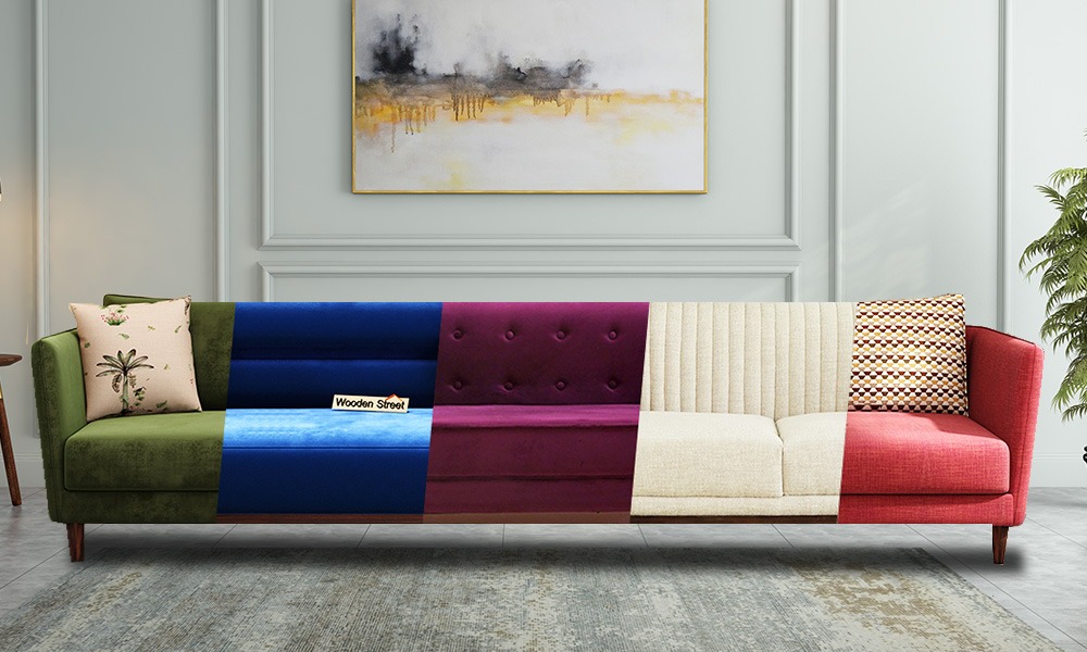


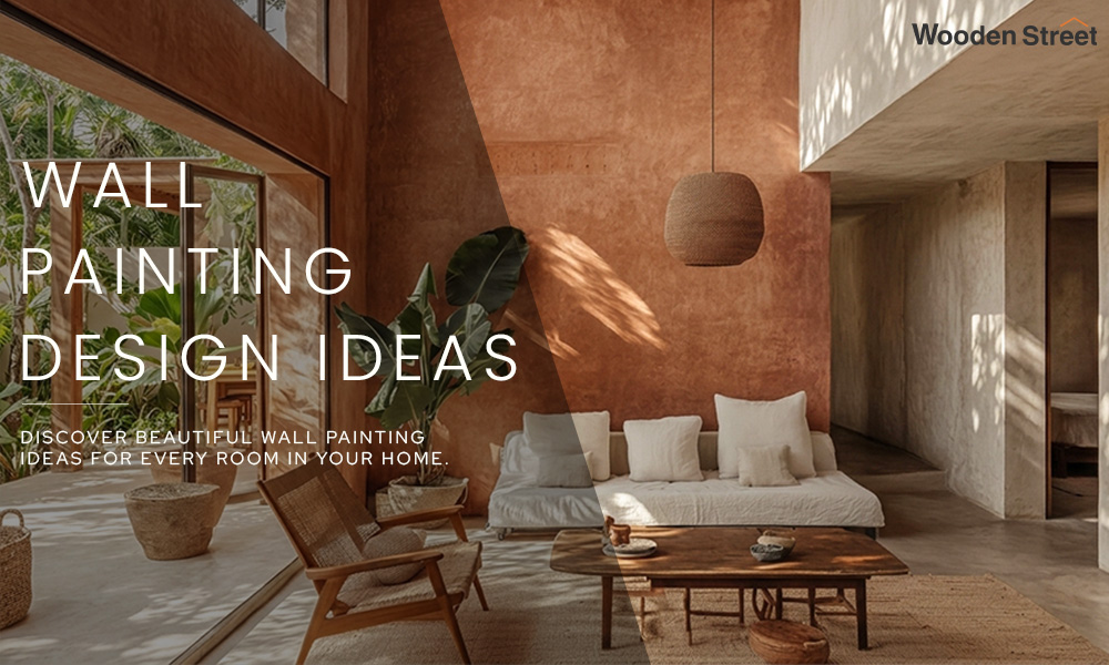
Wall painting design ideas for every room, from simple bedroom wall painting to bold accent walls, texture finishes, and colour combinations that suit Indian homes
Paint is the cheapest way to make a room feel new. No new furniture, no breaking walls, no big budget. Just colour going onto a surface, and the room reads differently the second the door opens.
Indian homes have always known this. The pre-Diwali repaint. That fresh coat before a wedding in the family. Half decor decision, half festival ritual.
What has shifted is the boldness. Cream and white used to be the whole menu. Now there is teal behind the bed, a sponged patch near the pooja unit, taped stripes across a kids room. And a fair bit of it gets done at home, over a weekend.
So here are wall painting design ideas, room by room. Bedroom, living room, hall, kids room, kitchen. Techniques, colour pairs, and the easy stuff anyone can try.
Skip these and the wall looks lovely for three weeks, then starts showing every flaw.
Two, almost always. One coat dries patchy over an old colour or a fresh putty repair, and switching to a much darker shade means priming first.
Touch dry happens in an hour or two, but the next coat waits four to six hours. Full curing takes a few weeks, and monsoon air drags every stage out.
Flatter hides a rough wall but hates a wet cloth. Shiny is the reverse, which is why kitchens go gloss while a bedroom can stay soft and matte.
Measure each wall, length times height, and add them up. A litre of emulsion covers around 100 to 120 square feet per coat, so plan on double for two, plus a little extra so later touch ups match.
Most wall painting design styles are really just one of these, done with a steady hand.
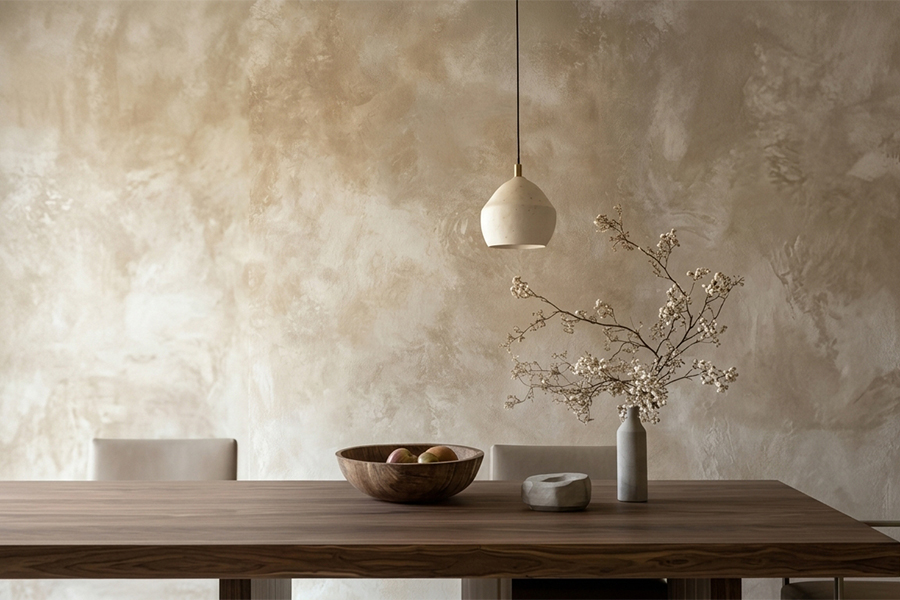
Raised, patterned surfaces that hide a tired, uneven wall beautifully. Sand finishes, suede looks, combed lines, trowel marks.
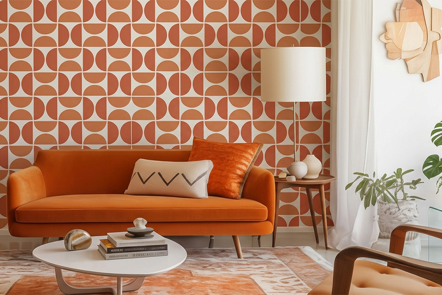
A cut out sheet, paint dabbed over, a clean motif left behind. Wallpaper richness for paint money, and one stencil covers a whole wall.
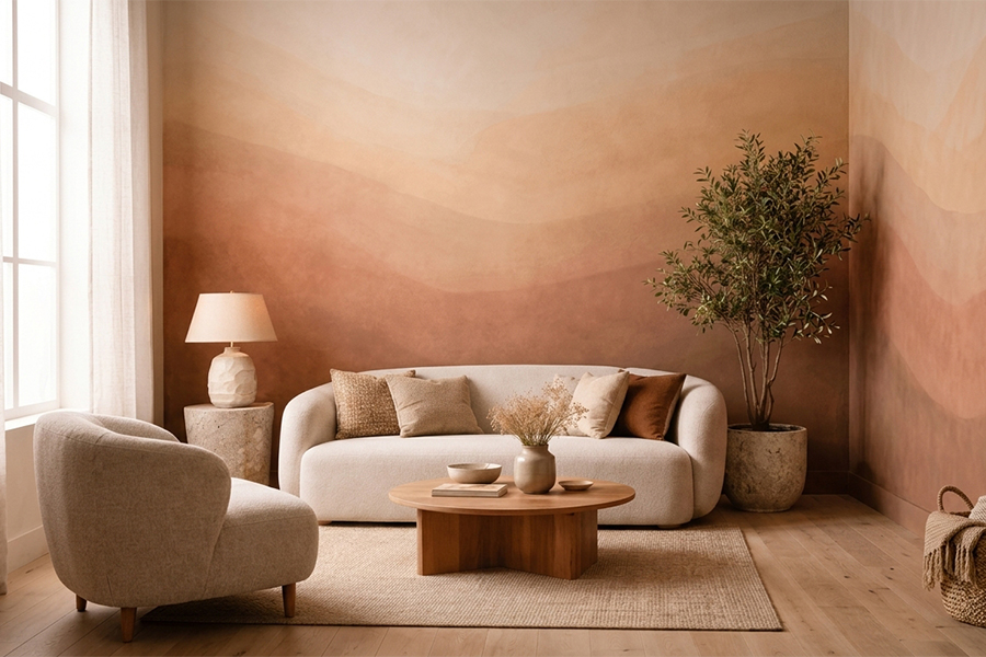
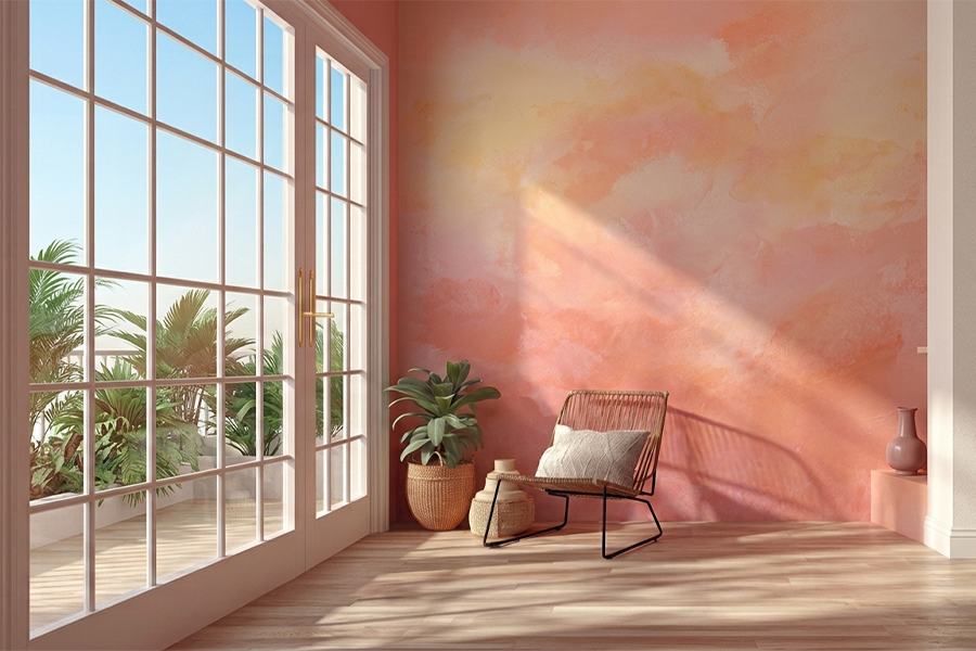
One colour melting softly into another, deeper near the floor and lighter up top. Worked wet with a sponge, it looks hand done and dreamy.
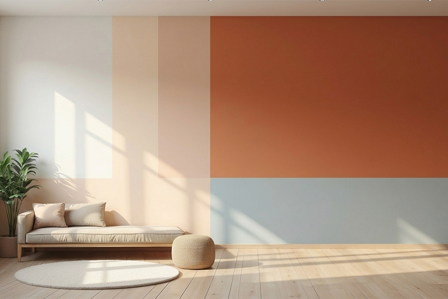
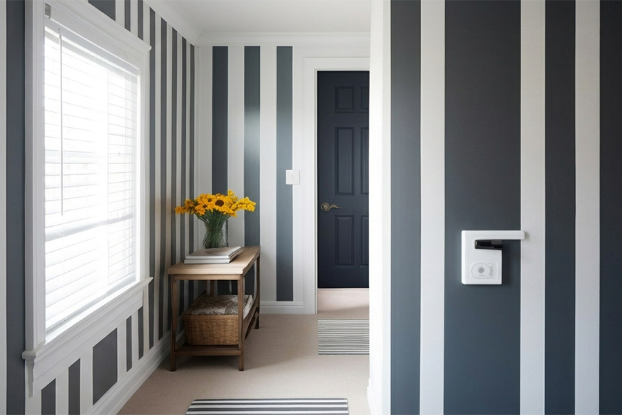
Split the wall in two with a clean line, or block out bold shapes. Tape does the work, which is why first timers reach for it.
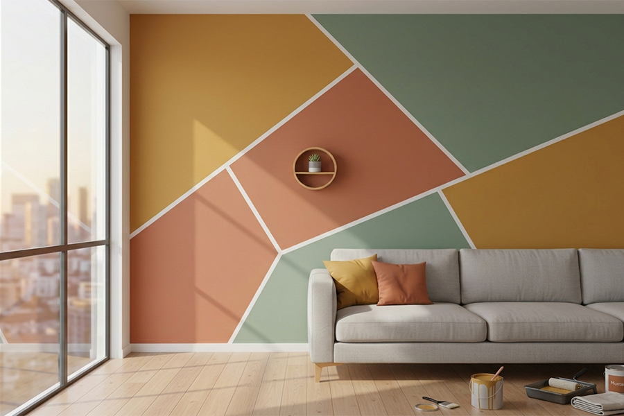
Triangles, arches, diamonds. Tape marks them, two or three colours fill them in, and the lines stay sharp without any drawing skill.
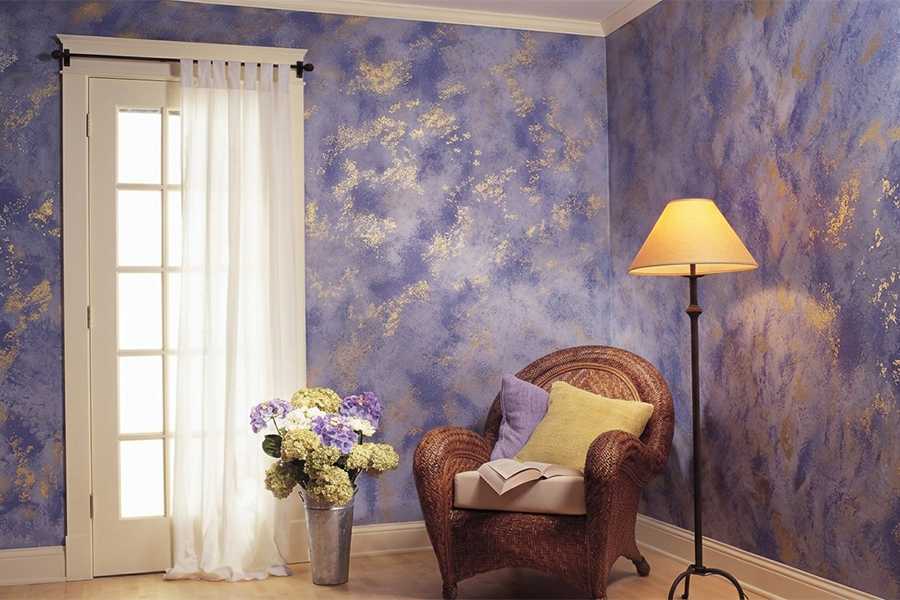
A bunched rag or damp sponge dragged over a base coat leaves a soft, mottled finish that forgives a less than perfect wall.
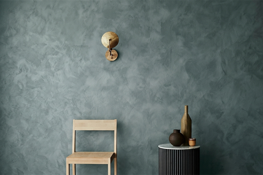
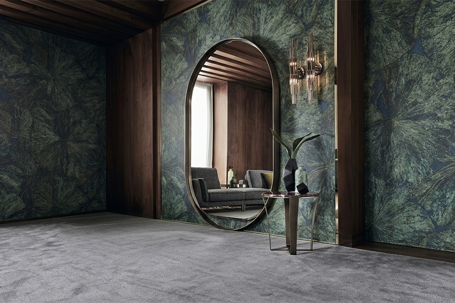
Pearl emulsions that catch light and glow faintly, gold, copper, champagne. One wall is plenty, since a whole room of it turns loud.
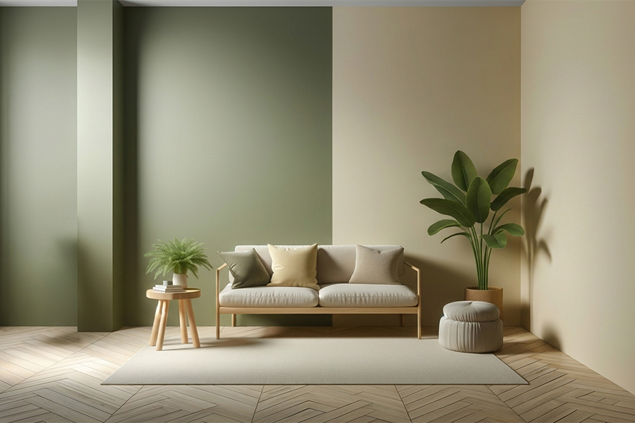
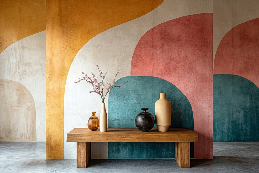
Three calm walls, one strong one. Costs almost nothing extra, takes the least effort, and still flips the feel of a room.
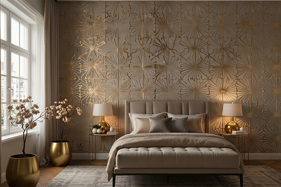
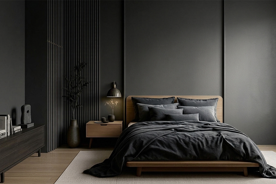
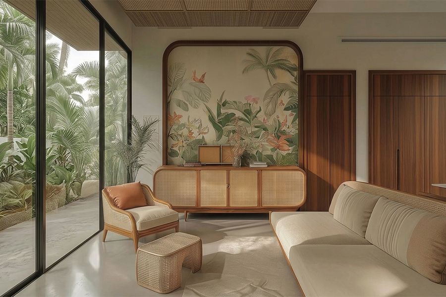
Colour gets selfish here, since nobody else has to agree with it. Which is why wall painting design for bedroom spaces swings from barely there pastels to one deep, moody wall.
Light, soft shades bounce light and keep a small room open. One accent strip behind the headboard, and simple bedroom wall painting is hard to mess up.
One muted tone across all four walls with white trims. Greige, oatmeal, dusty rose. Easy to live with for years, and it lets the bed lead.
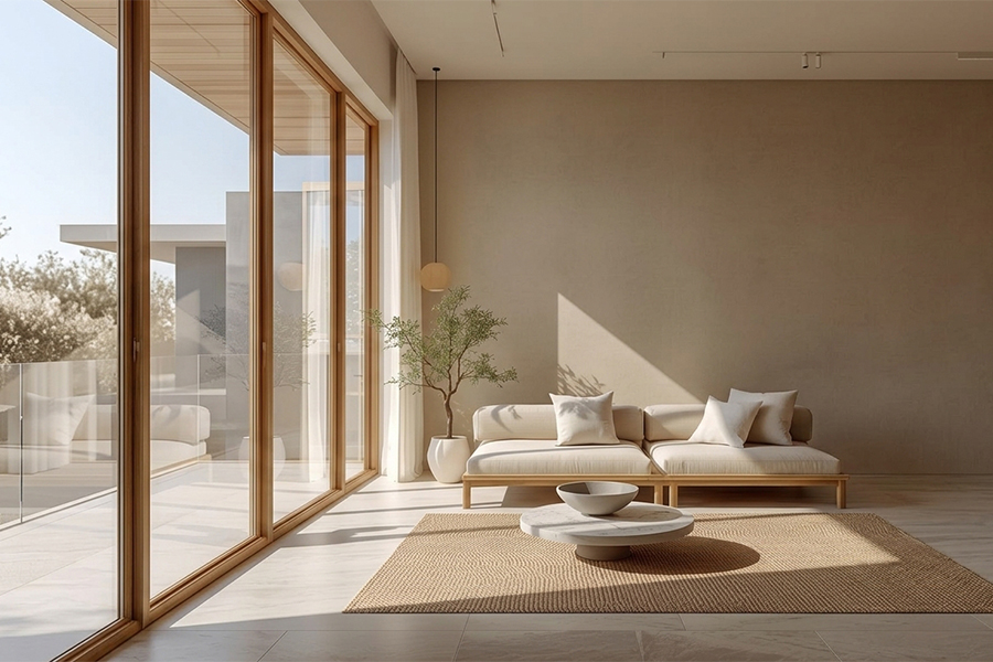
Warm beige, soft grey, creamy off white. Layer two or three close shades rather than one flat tone, so the room never looks washed out.
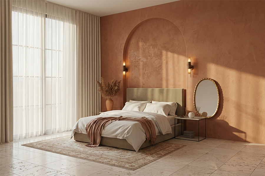
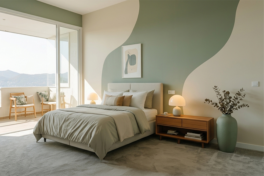
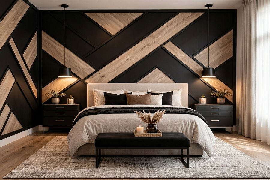
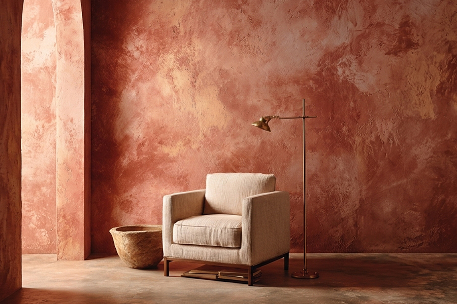
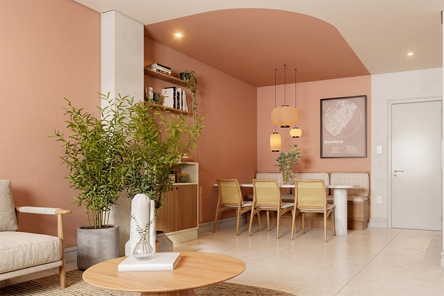
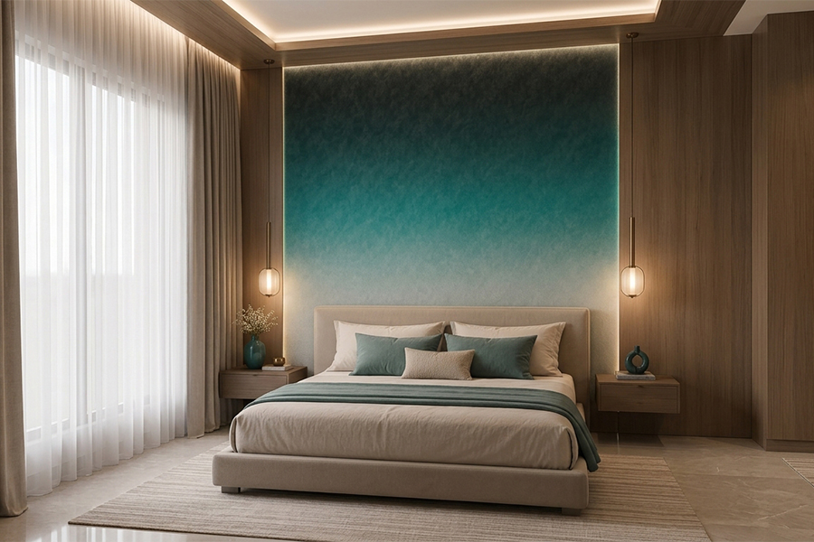
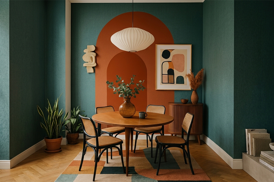
One deep wall behind the bed, teal, forest green, rust or navy, while the other three stay light so the colour reads deliberate, not overwhelming.
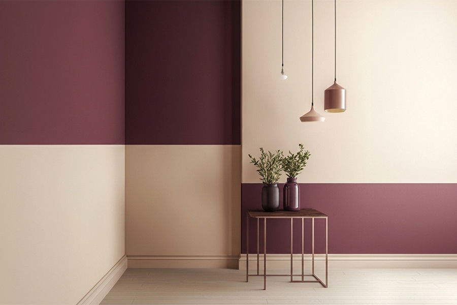
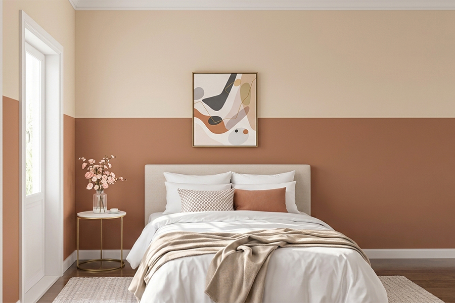
Deeper below, lighter above, for a grounded feel. A slim wooden batten or painted line marks the join, and tall ceilings carry it especially well.
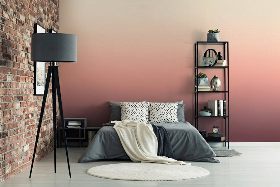
Fading from deep near the floor to soft near the ceiling brings an almost sunset calm. Blues, lavenders and dusty pinks do it beautifully.
A big arch behind the headboard, or soft diamonds in two tones. Keep the palette gentle so the pattern feels restful rather than busy.
Walls, ceiling and trims in one soft shade wraps the room and feels cocooned. Dusty blue, sage and warm terracotta carry it off best.
Powder blue, mint, blush, lilac. They photograph well, feel fresh, and sit naturally with white furniture and light wood.
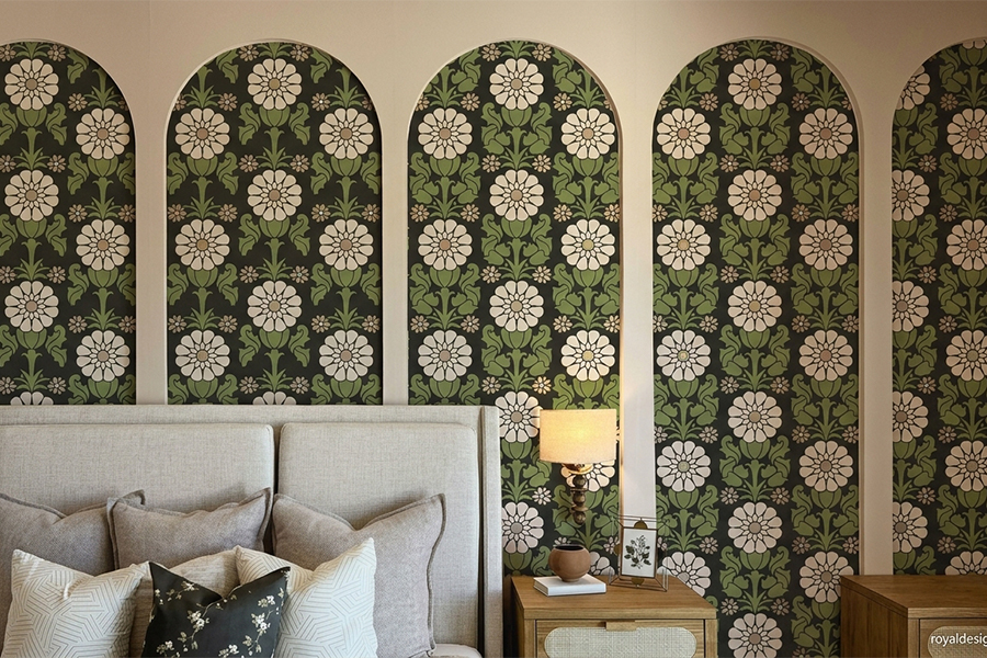
A damask or floral repeat behind the bed hands over wallpaper richness for less. Keep the stencil colour close to the base and it stays soft.
Suede or sand texture adds depth flat paint cannot reach, and evening light wakes it up. Warm earthy tones suit a bedroom, snug rather than cold.
More wall means more drama. A charcoal or deep green wall behind an upholstered bed, a shimmer panel, or a full colour drenched scheme.
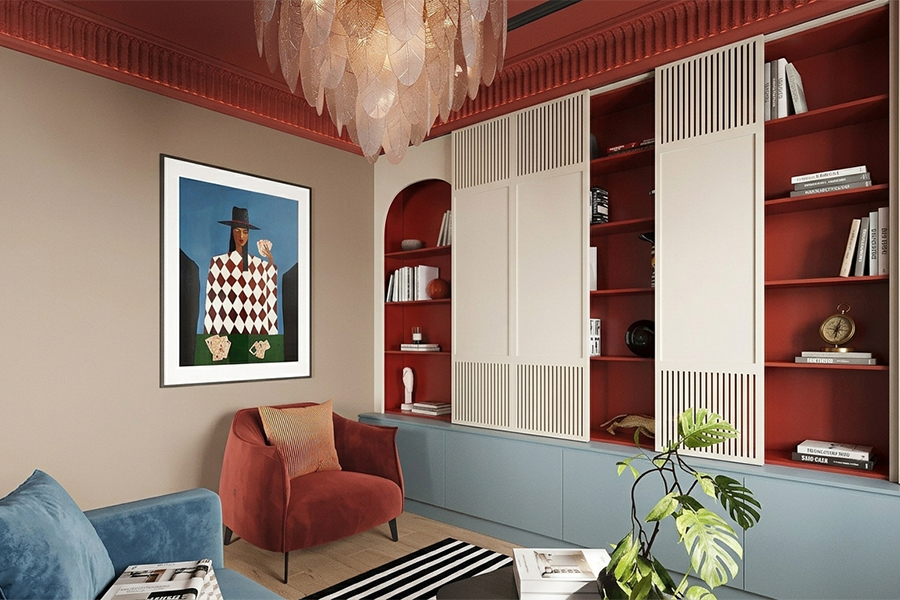
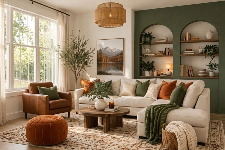
The wall guests clock first, so it earns the most thought. Get the room paint design right here and the whole house feels lifted.
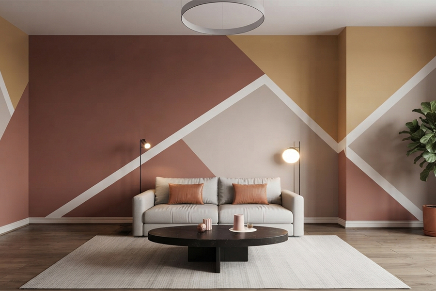
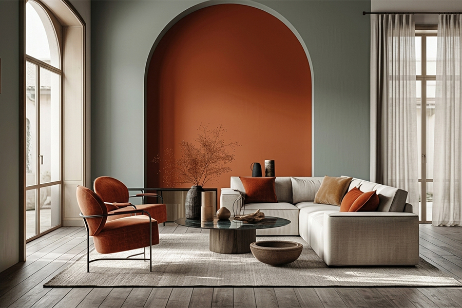
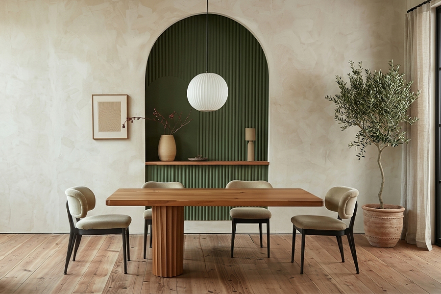
Clean colour with one point of interest, a deep wall or a textured panel. Greys, greens and warm neutrals lead, with one richer shade for contrast.
Concrete looks, combed patterns or suede add depth under warm light, and the texture hides the scuffs a busy room collects.
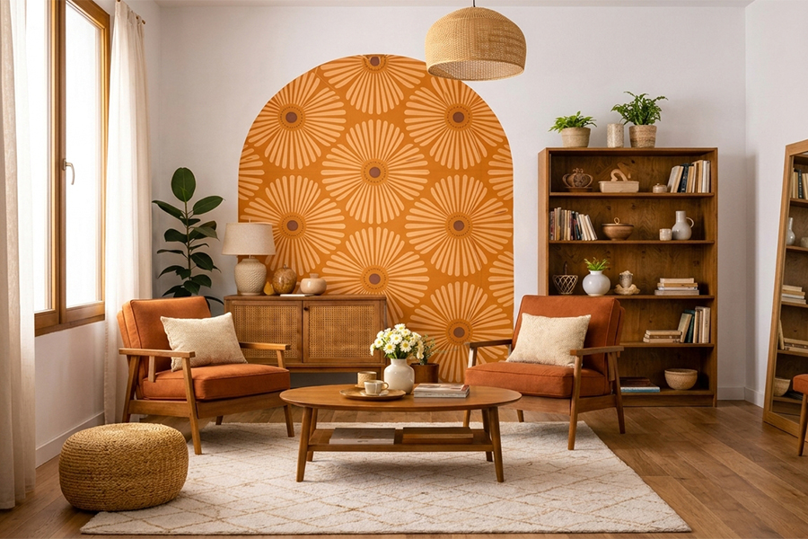
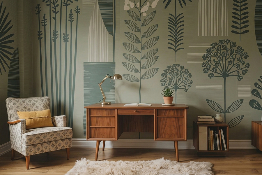
A large jaali or floral repeat turns one wall into a feature without wallpaper money. Tone on tone reads graceful and never shouts.
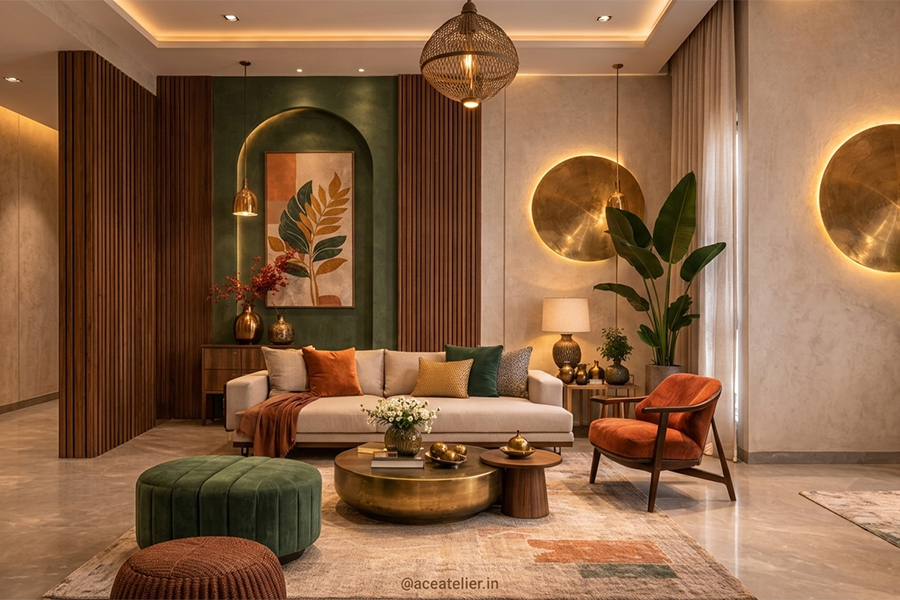
Behind the TV or sofa, deep colour with the rest neutral, hands the room a centre instantly. The single most useful paint design move here.
Warm neutral on top, deeper earthy tone below, split flat or shaped into a painted arch. It grounds whatever furniture leans against it.
Panelling warmth at paint prices. Soft browns and a dry brush feel natural behind a sofa and sit well with the wooden furniture most homes own.
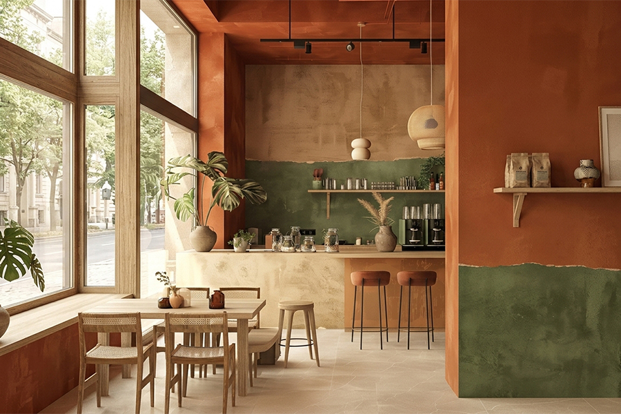
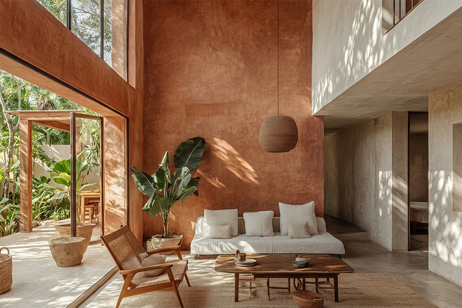
Terracotta, mustard, olive and warm sand glow under Indian sun, far better than cold greys, and go happily with brass and bright textiles.
Bold colour, a big stencil or a textured panel. Keep the sofa plain so that wall does its job without crowding the corner.
The hall sets the mood before the living room, and a thoughtful deewar paint design at the entrance handles the space as much as it decorates it.
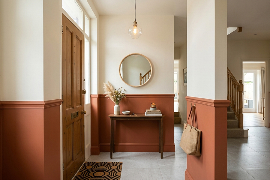
Light shades and one focus point open a tight hall. A slim stencilled border works too, and mirrors set nearby pull light deeper inside.
A neutral on the long walls and a deeper tone on one end wall draws the eye through and makes a corridor read intentional rather than leftover.
Stone or combed texture near the entrance makes the spot memorable and hides the knocks a passage always picks up over time.
A jaali or geometric repeat running down a plain stretch gives it rhythm without piling on heavy decor.
Paint frames the mirror, the mirror throws light back, and a narrow hall ends up feeling twice as open.
Paint gets to have fun here, brighter and a little silly. One rule though, pick washable finishes, since sticky hands are a certainty.
Stars, clouds, animals, dinosaurs, scattered loosely or repeated across one wall. Cheap, cheerful, and easy to paint over when the obsession switches.
Leafy greens with animals peeking out, or a simple tree with a few birds. Cheerful and calm at once, and it grows with the child for years.
Yellow with sky blue, coral with teal. Keep the bright bits to one or two walls so the room stays calm enough to sleep in.
Polka dots, a rainbow arch, taped stripes. Barely any skill needed, and kids usually love helping with the simpler parts.
Grease, steam and splashes. Looks matter, but so does surviving a wipe down on a busy night.
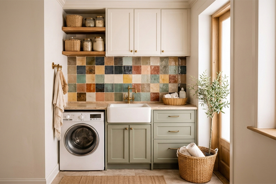
Satin and semi gloss take regular wiping without losing colour, and washable emulsions shrug off grease far better than flat matte.
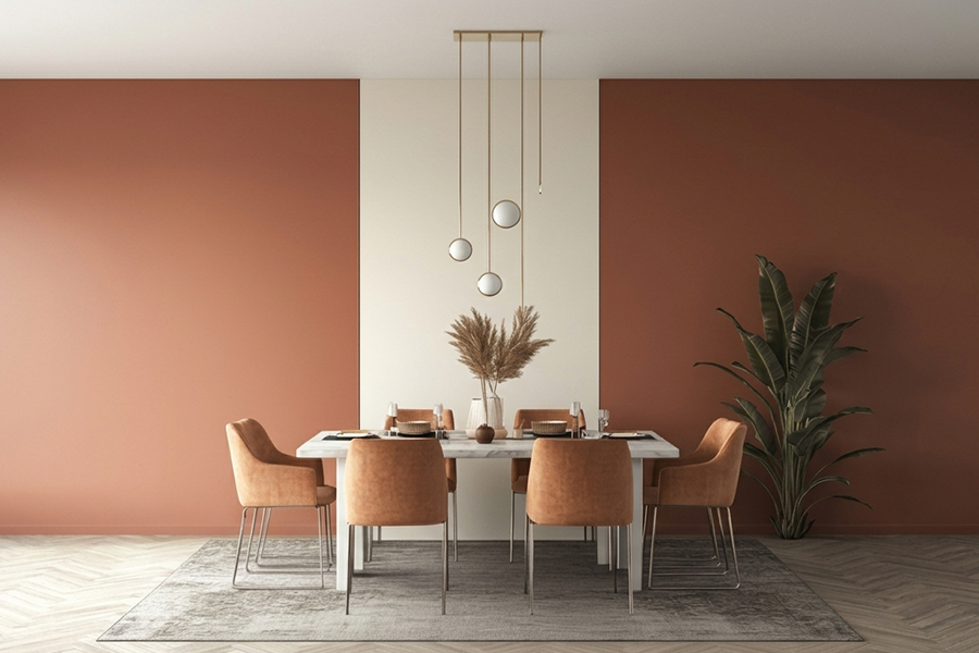
Warm shades feel inviting around a table. Terracotta, mustard, warm green, and one deeper wall behind the table anchors the area.
A bold colour, a textured panel or a big stencil turns an everyday corner into a feature, handy in open layouts.
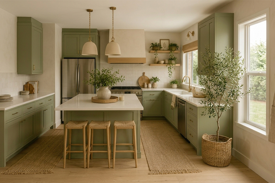
Wipe clean emulsions handle the oil, haldi and stray splatter near the stove without staining or fading in a hurry.
Single colours are simple. Combinations are where rooms find character, and a few pairings just sit right with Indian light.
Mint with white, lavender with grey, peach with cream. Light, airy and easy, which is what most apartments are reaching for.
Terracotta with cream, olive with beige. They go naturally with wood and brass and take harsh afternoon light without going garish.
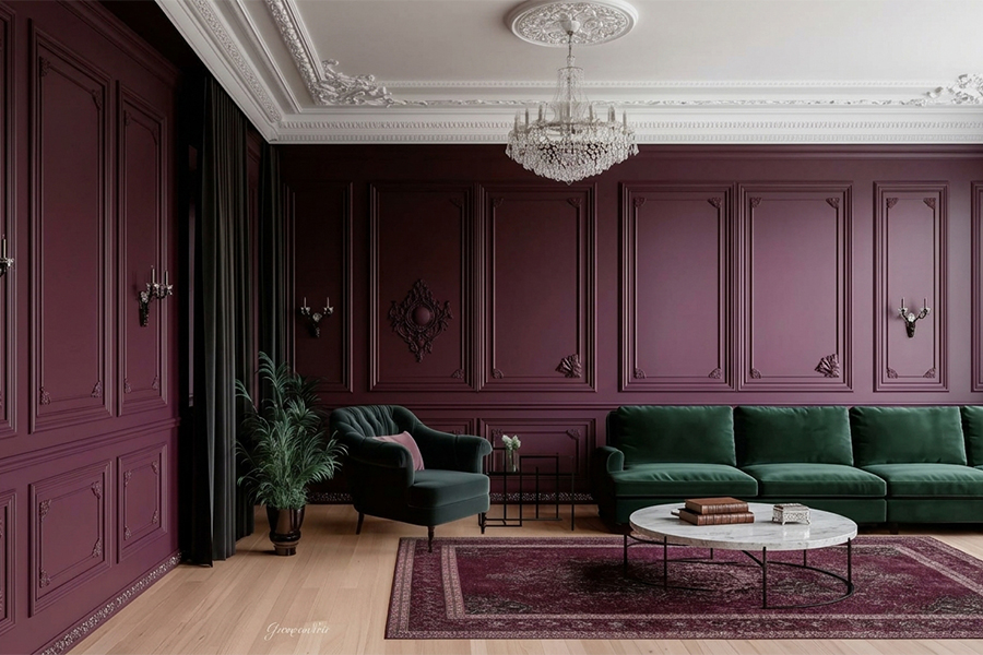
Charcoal with tan, navy with gold, forest green with cream. Best kept to a single wall, snug and full of character.
White walls, wooden furniture, warm tones. Calm, clean, timeless, and it lets the grain show off. Close to foolproof.
Greige with white, pale blue with off white. The gentle shift adds a little depth while keeping a small room open.
Comes up constantly. The honest answer depends on the room, the budget, and the weather where the home is.
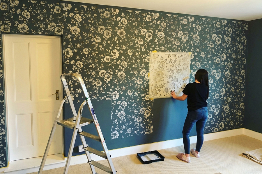
Wallpaper starts higher and is priced by the roll, with fitting on top. Textured paint usually works out cheaper across a full wall.
In humid cities and through the monsoon, wallpaper edges lift and bubble, while a good textured paint rides those conditions out better.
Wallpaper goes up faster and swaps out easily. Textured paint takes longer and is a pain to remove, but once on, it lasts for years.
Wallpaper for dry bedrooms and studies. Textured paint for living rooms, halls and damp corners.
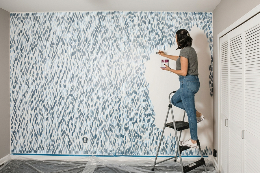
Not every wall needs a hired crew. Plenty of wall painting at home projects come down to tape, a roller and a free Sunday.
Mark even bands, paint the gaps, peel while still slightly wet, and clean lines appear. Vertical stripes stretch a wall taller, horizontal ones wider.
Dab a damp sponge over a base coat and a soft, cloudy texture builds up. There is no wrong pattern, and it hides a rough wall while it is at it.
Tape it flat, dab a little paint, lift and slide along. Less paint and a flat stencil keep the edges crisp instead of bleeding.
Dark at the bottom, light at the top, then soften the wet join with a sponge until the shades melt together. Speed counts here.
Tape a rectangle, circle or arch, fill it with one bold colour, peel the tape. A graphic finish behind a bed or desk in one afternoon.
The choice gets simpler once it is narrowed by the room itself, not by whatever looked nice on a swatch.
Light shades open small rooms, bigger rooms carry deeper colour. Small but want drama? Keep three walls light and go dark on one.
A shade that looks soft in daylight can turn cold under tube light. Test a patch across a full day before buying buckets.
Bedrooms suit calm matte, living rooms richer colour and a feature wall, kitchens washable finishes, and kids rooms bright and wipe clean.
Economy ranges for quiet rooms or rentals. Higher tiers cover better and last longer where the wall takes daily wear, so spend up there.
Paint stays the easiest, cheapest way to change a room, and the choices have never been wider. Calm matte in the bedroom. A satin feature wall in the living room. Washable gloss where the kitchen takes a beating. A bold accent behind the bed, or taped stripes a child can help with. None of it needs a fat budget or a hired crew, just a free weekend and a little nerve. Pick the finish for how the room actually lives, test the colour under real light, and start with one wall before going all in. And the best part, the day it stops feeling right, fresh paint goes straight back over the top.
More room by room wall painting design ideas are on the way in the next blog. Till then, stay tuned!
Read More :
Read this - Lighting Colour Guide for Indian Homes !
Image Source: Pinterest, Google, and Wooden Street
A Warm, light shades work best. Cream, warm white, pale yellow and soft peach brighten a dim room, while cool greys only look flat and dull.
A Normal paint goes on smooth and flat, mostly about colour. Texture paint is thicker and patterned, hides wall flaws better, but is harder to repaint.
A Washable, moisture resistant emulsions that resist fungus, with a good primer underneath. Painting in heavy monsoon weeks is best avoided, since damp air slows drying.
A Yes, if it is clean, dry, and loose bits get scraped off first. Prime before painting. The old texture still shows through, though.
Articles you will love to read

Explore the 26 biggest interior trends shaping homes in 2026, from furniture innovations and colour palettes to decor inspirations. This guide covers everything you need to elevate your Home Interior Design with stylish, functional, and future-ready ideas for every room.
Continue Reading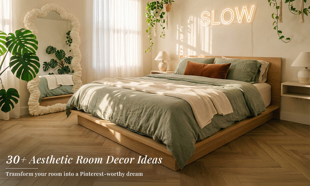
Discover simple aesthetic room decor ideas using mirrors, posters, lighting, and furniture to create a stylish and comfortable bedroom setup.
Continue Reading
Practical PG room decoration ideas for students. Simple setups, useful furniture, and easy ways to improve your space.
Continue Reading
Planning to buy a chandelier or pendant light? Explore chandelier sizing, pendant placement, ceiling load limits, style matching, and installation tips
Continue Reading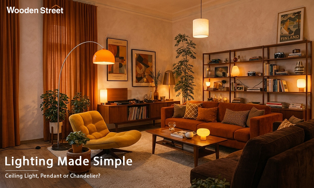
Choosing a light fixture is not just about what looks good. Every fixture has a different job to do. This guide explains the different types of light fixtures, where they should be installed, and how to create a balanced lighting setup that makes every room feel complete and much more useful.
Continue Reading